Since 1976, my focus has been on a range of visual and spatial
poetries with differing and shared concerns. Derivation, including
incorporation of previously used and extant materials, as well as
the investigation of and expansion upon visual poetries of other
writers dedicated to the visual page, and a poetics generally
insistent upon practical utility and function, has guided much of
this work.
While much of what's discussed and investigated over these
several pages concerns projects and strategies that I pursued during
the closing decades of the Twentieth Century, the work's impact
and potential for emerging poets and artists working in digital
formats is sweeping and unmistakable. Visual literacy and its
practice are of increasing cultural interest and adaptation. With
each year its purposeful application expands. There's much to be
learned for coming generations in the following discussion.
*
Active as a mail artist in the dynamic worldwide network,
around 1976, while living on North Lincoln Avenue in Chicago, I
coined the word poeMvelope. Behind the term was the
concept of rubberstamping poems on the flap side of envelopes to
make what was a functional physical object, mailable
internationally, impressionistic, often lyrical of language, kinetic in
arrangement and composition, poetic in lexical cosmology.
Interested in the physical textures of type, ink and paper and
motivated by a political poetics that celebrated and respected utility
and usefulness, conceiving and composing a visually tactical poem
on an envelope proved a fortuitous and durable artistic act. And,
quite specifically, I developed poeMvelopes out of
practical need, having moved several times over a few years. In
this pre-email era, I preferred to stay in contact with my network of
friends, poets and editors by correspondence as opposed to
telephone. I wrote many letters, not infrequently a dozen or more a
day, and many of my letters included (and were frequently built
around) poems—drafts seeking feedback, submissions, editorial
exchange, and letterpoems to friends who were practicing poets
and writers.
Using a Justrite Office Rubberstamp set and a single black ink
pad, my practice was to set from one to four rows of rubber type
and stamp on the verso of four envelopes (the desktop blotter pad
that I worked on providing surface area to arrange up to this
number of envelopes) these poems of four or fewer lines. As I
worked I often had theoretical, formal or erotic objectives that
invariably included attentiveness to visuality of impression and
certain criteria of visual poetics. My interest extended subjectively
in that I also sought to anticipate the receipt of the
poeMvelope by the addressee and I wanted to produce a
wrapper that would move, delight or in some way have an impact
on the recipient. And, I enjoyed, indeed I marveled at, the
suddenness of visual poetry's presentation of itself as I accepted or
initiated opportunities of correspondence.
Before the end of The Cold War and prior to the "information
revolution," Mail Art was a network of edgy and frequently
politically outspoken artists and the making and mailing of
poeMvelopes constituted critical and even dangerous
activity. Mail censorship was not uncommon, even in countries
that one might presume to be dedicated to free expression and
unfettered correspondence. The daily post was a moment of arrival
and what arrived was unannounced. Even now, the intimacy and
discovery of meaning in the personal letter enveloped in its own
wrapper carries an implicit message of singular meaning, of
uniqueness of intent, a manner of action initiated from elsewhere to
one's home, mailbox, hands and fingers as the words reveal
themselves and accumulate. Today, when the very existence of a
unified global postal system is threatened by the speed, minimal
cost and economies of digital transmissions, it is easy to lose sight
of personal mail's significance and desire. Some of Mail Art's
inherent qualities require a sensitivity to the postal system's
political, uniquely systemic global values, for example: convicts'
numerical I.D.; samiszat circulation; the word's actual resiliency,
perpetuity and power; uniform codes of stamps, weights and
measures; and perhaps most importantly, the reality that
handwritten messages were carried essentially from one hand to
another's somewhere on the ultimate planet, making it past all the
censors and barriers that interrupted unrestricted expression - those
that were and those that are. For me, poeMvelopes
expanded the poem internationally while avoiding all hierarchies
and barriers of editorship. And, they enabled me to concretize
poetry by the envelope's relatively confined surface requiring
concentrated and essentially minimalist strategies of language.
PoeMvelopes, and the wider range of mail art in a
complexly cross-medial way, investigate public/private expression
and exhibition, constituting a kind of mute and disembodied
performance. In this fuller context, poeMvelopes examine the
common denominators of the planet's written codes and groove on
letteristic wiggling of form.
Mail art, with its tacit bylaws of universal artistic democracy
and quest for a borderless and post-national language, offered an
alternative creative universe for visual artists disinterested in or
excluded from galleries and juried exhibition. Mail art provided an
option to literary publication and was an available, subtle extension
of what I practiced as a poet and correspondent.
Drawing on language bits from my pocket notebooks, I'd
develop the look and arrangement of the letters by inky rubber
stamp noodling. Thinking more in letters than in words or ideas, I
consciously built what might become a word from an initial mark
or letter. In the studio I'd make an edition run of eight to twenty
rubberstamped poeMvelopes, all but a few (which were
kept as artist's proofs and archival copies) subsequently addressed,
posted and released into that preemail grid of worldwide postal
codes, box numbers and addresses to engage remote and actual or
pseudonymous public/private politics, emotions and artistic
motives.
In AD 2001, correspondence in general and Mail Art in
particular rely upon different technologies and webs of connection
than was the case not long before the millennial pivot. That's
another discussion. Click here for reduced images of
poeMvelopes
These poeMvelopes were quickly made on a laptop
easel while on a mail art drive through northwest Ohio in 1983. I
packed a compact car kit of rubberstamp type and forms, several
inkpads, envelopes, postcards and postage. My spouse, Cynthia,
drove. I kept notes and stamped, keeping my senses and
imagination alert to opportunities and images as we stopped in the
agricultural region's towns and along rural roads. I'd do a set of
four, the number of envelopes I could fit on the board while
retaining room for a few rubberstamp letters and an ink pad or two.
As we came to post offices in the various communities I'd mail off
fresh pieces to regular correspondents, mail artists and upcoming
exhibitions. The work above is gestural, immediate in its active
connection to time and place and produced while the car was in
motion.
*
During the 1980's I edited three concept periodicals,
Bagazine, The Sleeze Art News (SANS),
and 11x30. I approached these fraglit editions as blending
time-capsule reportage, infobites and newsletter gossip with my
interest in unique editions and obsolete books, ephemeral
language, fragments, scraps and bits (hence, "fraglit," fragments of
literature), fugitive inks, discarded waste papers and founds—all
manifestations of periodicity. The Sleeze Art News was
textual in parodic approximation of a newspaper and laid out in
ways that drew on the visuality and immediacy of a noisy front
page.
Bagazine was less systematic, more loose-leaf and
generally filled an envelope, poeMvelope or some other mailable
bag with whatever materials I was involved with at the time -
photostrips or contact sheets, aged paper gone to dust, cutups,
drafts of poems, recycled junk mail, language concepts. The idea
for Bagazine arose after a trip to a Detroit envelope
factory where I was introduced to the vocabulary and industrial
process of that niche of the paper industry. A certain kind of cheap
die-cut envelope is known in the trade as a "bag."
Each edition of The Sleeze Art News was a unique
product. One representative example includes eight paper items in
addition to a 5&1/2 by 4&1/2 inch wrapper on which my typed
newsprint note reads in full: Note//some of a larger group of postcards
designed & executed while traveling across Ohio & based on familiar &
impressionistic signs. ALSO CONTAINS: 2 b/w reduced photocopies of
designs to appear in forthcoming ASSEMBLING (ed. Richard Kostelanetz).
Submissions asked to respond to the question: IF YOU COULD APPLY FOR A
GRANT OF $500,000.00 WHAT PRECISELY WOULD YOU PROPOSE TO
DO?//& 2 postcards designed on data printout cards, one pink and one blue.
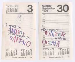
Above are two desk calendar pages from a prior calendar year.
The concrete idea is to set two lines of rubber type, one reading
"You were in" and the other reading "I was in," printing them in
varied sequence. Between these lines of text, and in eccentric (what
some font menus refer to as "San Francisco") type, I'd stamp
names of towns drawn from the road atlas—a travel exercise that
takes its particular pleasure from being conceived and made on-
the-roll. A visual suite of missed opportunities and bad timing
emerges from the three-dozen pages, which I arranged in pairs and
groupings like the two pages from this edition of (SANS).
These projects provided structures for a range of visual
language, much of it a graphic languagescape more expansive than
the lesser geography explored by visual poetry. Other Sleeze Art
News (SANS) and Bagazine inclusions and texts examined
typography and photography, catalogues, lists and an array of
paper ephemera. For example, using a portable ditto machine (yes,
the hand-cranked variety that relies upon smelly purple ink) and
carefully cut ditto masters, I printed out an edition of (SANS) on
the backs of canceled checks from the Toledo Bath House, a
longstanding neighborhood bath house that had recently closed.
Each complete issue ran about twenty pages, twenty checks. On
one side of the check was a text about cultural, literary, or local
history matters containing some personal reflection on public baths
in general and the Toledo Bath House in particular, while the other
side was a cancelled check made out ten to twenty years earlier to
some person or business, usually for small payments like $4.58 or
$23.50. The project was conspicuously voyeuristic and erotic. It
also was dependent upon and implicitly derived from a received
text, structurally challenging and engaging, tactile and very much
about things periodic.
Click here for a visual language cut-up
from an issue of Bagazine.
The third journalistic visual poetry project in the late 1980's
and early 1990's was the considerably more elegant and formal
offset periodical 11x30. 11x30, the title reflecting
the dimensions, in inches, of this broadside publication that I
edited and designed with the assistance of Sandy Koepke, staff
artist at the University of Toledo Publications Office, was
composed and printed using considerably higher production values
than either Bagazine or The Sleeze Art News.
11x30's production reflected Sandy's professional design
skills and featured paper stock that differed in color and ink from
issue to issue. It always included visual and lexical poetry by some
of my correspondents and friends, among them the poets Howard
McCord, Christy Sheffield Sanford, Michael Kasper, Bern Porter,
John Brandi, Paul Hoover, Geof Huth and Richard Kostelanetz,
and each issue also served as a flier announcing upcoming
performances and readings I'd booked in my capacity as Director
of the Toledo Poets Center. I had the printer punch a hole center-
top so the broadside could be neatly pinned up, kept and displayed.
11x30 was showy, of unusual proportions and provided an
excellent field for the publication of visual poetry, in that it
spaciously arrayed and distinctively printed visual and lexical texts
on a long sheet of high quality (though not archival) paper.
There was a mail art subset of values built into the editing and
production of 11x30. I had gradually become more
intrigued by personal networks of affection, friendship and taste,
and I consciously wanted 11x30 to demonstrate how so-
called "schools" or literary movements relied upon, though often
were reluctant to objectively admit, that they built their status and
excellence by recognizing and valuing literary, romantic and
personal affinities. By 1990 I'd sat on enough grant panels and
fellowship juries, read enough you-for-me-me-for-you jacket
blurbs, been to the requisite conferences, readings and confabs,
read the litmags and culture rags enough to recognize the
friendships that brought certain groups of writers together in
performance or print. Perhaps because I've enjoyed benefits as a
poet through the blended personal-and-anonymous network of mail
artists, I generally support and respect friendship as the basis for an
artistic project or inclusion, and while at its menial worst it yields
cronyism and schmoozy praise, when personal friendship
encourages the creative product of talented and otherwise
overlooked artists it offers an opportunity for exciting
breakthroughs, generosity and opportunities. I know where I stand
on this frequently contentious matter and as Toledo Poets Center
director I dispensed an annual presenting budget of four or five
thousand dollars a year, bringing in writers, poets and literary
ensembles that I valued or knew about and wanted to sponsor at
community venues. Friendship and artistic merit can be
intrinsically rewarding interconnected values.
11x30 used a poster format to announce upcoming
readings and present a glimpse of the poet's art, accompanied by
the work of other writers and artists I was in contact with and
whose work I respected and sought to promote. I viewed the
broadside as a chance to create a public for my interesting private
correspondence. 11x30 was rather widely and always
appreciatively reviewed. Poetry archives ordered it for their
collections and a number of individuals subscribed, though I'm
sure I was a less-than-reliable managing editor. Had 11x30
been a CD, it would have been considered a crossover product, as
it straddled that literary market line between ephemera and
archival. The issue announcing one year's performance of an
annual Jack Kerouac reader's theatre production, "Back To Jack,"
featured the full publication of Kerouac's "I Had A Slouch Hat
Too" and 11x30's premier issue republished d.a. levy's
"Tombstone As A Lonely Charm" along with two of levy's
concrete cut-ups in what I would argue is the finest presentation of
these texts to date. The wheaty papers and rich brown inks used for
these issues displayed the work clearly and with an antique tone
suitable to a broadside rendering of postmodern masters, each
prematurely dead.
Periodical literature is invasively nostalgic, instantly extending
into and inspiring memory. These projects all accepted and
noodled this emotional key. Perhaps, in my appreciation of the
opportunities nostalgia (and its deprecated partner, sentiment), I
reveal an inexact understanding of one of my graduate school
mentors, the late poet James Wright, a man quite masterful at
locating the opportunistic edge of memory and infusing nostalgic
recollection with bite, energy and depth.
*
As has been my practice for thirty years, I write poems lexical
and linear as well as those composed by actively plosive visual
strategies and concrete poetics. Spatial poetries, field poetics and
visual literatures iconic histories and prehistories are fundamental
to their reading and pleasures. Writing poems is habitual activity,
its requisite tools little but notebook and pen, and I always have
both in my pocket or pack. The typographic spatialities have
become gestural and almost go unscripted in my notebooks, with
breaks, white fields, lateral and vertical pauses and alignments
generally adjusted at the drafting table, typewriter or computer, all
of which I use along with pencil and pen. Though I briefly flirted
with one, I do not compose using a laptop. Elsewhere than in office
or studio I write by hand and use the arguably obsolete or
inefficient technologies of handwriting.
The pleasures of mark and smudge and the shaky legibilities of
my hasty cursive are more gratifying to compose than the crisp
registrations of keyboard and printer. The typewriter, so obviously
archaic and incapable of state-of-the-art visual specificities in a
digitized world, becomes obsoletely pertinent at this technological
juncture and the visual meaning of typed poetry is thus imbued
with fresh opportunities and replete with noir registries
and signification.
Brian Richards, publisher of Bloody Twin Press, in 1984
printed a lovely letterpress broadside of "My love is," a spatial
poem previously published in the journal of erotic poetry, Yellow
Silk, and subsequently in the Toledo Poets Center Press anthology,
Glass Will. During 1986, Richards invited me down to his
shop in the Ohio River town of Blue Creek to collaborate on the
typesetting and printing of unique covers for the subsequent
Bloody Twin Press edition of my small book of translitics,
Provocateur.
The tangible activities of holding type and setting it, damping
and pulling weighty rag sheets, the smell of ink and solvents -
these are sensual pleasures that have their impact on the patina and
patterning of visual poetry. Letterpress printers not infrequently
possess an appreciation and understanding of spatial and
typographically open field poetry well beyond that of writers
lacking the experience of the print shop. Many of the finest visual
poets and masters of the overall page have been practicing printers
and engravers.
Lester Dore, during a season of work in 1988 at Walter
Hamady's Perishable Press, set and printed a broadside edition of
my poem "What Do You Do With Mountains." Dore's
composition included his intricate geological rendering of
Wisconsin's unglaciated southwest as part of an expansively
conceived Ocooch Mountain Press bioregional packet. Alphabets
emerge from drawing. The cartographic clarities and symbolic
details of mapping, in this case Dore's cutaway sketches of
drumlins and moraines, echo certain prealphabetic signs, simplified
representations and repetitions of line. Tim Ely, in his several
artist's books exploring imaginary maps, inventive geographies
and gibberish gazettes, takes this relationship between spatial
language and the presumptive geographies of mapping to a
particularly interesting place.
The textures and impress of letterpress, with its almost Braille-
like code of fingertips and invitation to touch, adds measurably to
the language and referential relief of visual poetry. The codes and
history of gouge, smudge and scrim, of stylus mark, etch and
embraded rock is retained in the bite of the printer's press. In my
studio practice it is difficult to separate the use of materials derived
from letterpress printing from those designed for use as
rubberstamps. My visual poetry, as well as my studio environment,
mixes implements from both technologies.
And, specific to Dore's geological rendering of southwest
Wisconsin's landforms that shares space with "What Do You Do
With Mountains" on the softly textured paper he chose for the
broadside's printing, using language cartographically or in
gazettelike proximity to such artwork reaffirms the genesis of
writing in drawing, helpfully articulating the birth of letterforms in
the line's ascending and descending variations and extensions.
*
For an Ann Arbor gallery, calligrapher Susan Skarsgard created
a series of 30X48-inch ceiling hung, translucent Mylar panels of
my conventional linear poem "The Beautiful Letters." The
manifestations of physical language Skarsgard explored in her
calligraphic rendering were challenging to encounter. Her
calligraphy is freewheeling, at once both powerful and graceful of
stroke. She is an inventive, brave practitioner. Ambient light
filtered through five sculpturally hanging sheets on which she'd
enlarged and reduced portions of lines and words from the poem.
The background and foregrounded letters were of contrasting
frosted translucence.
While it is an extraordinary gift to have another artist locate her
possibilities in the visual and spatial suggestions of one's work,
Skarsgard's work posed for me the arch problem found in the
calligrapher's aesthetic presumption—that s/he can appropriate and
refabricate the shaping design and lyricism of another's text. This
is a large and complicated question for the entire arts community,
one driven by many interlocking technologies and cultural
assumptions which make the reuse (sampling, copying, versioning,
collaging, reprinting, etc.) of another artist's creative product
materially feasible and artistically interesting. It raises an
increasing range of issues for visual language artists.
"The Beautiful Letters" was originally dedicated to Skarsgard
after I heard her discuss her work during a slide/lecture at a
suburban Detroit library. This is important to understand and
respect, because visual poetries routinely draw upon and derive
from extant texts and available visual materials. Calligraphy has
historically represented, explored and exploited existing texts and
fields of language, transforming common print into "beautiful
letters." Visual poetry's ideas, tropes and imagery reside in the
physical letterforms and concretions that are also the poem's
words. A certain common impulse and perhaps parasitism unites
poetry and calligraphy.
I rebuilt language from Skarsgard's lecture and slide show,
which had previously lifted ideas, images and materials from its
sources. Bits of her words and the rhythms of her lecture's spoken
arrangements were appropriated by me, becoming part of the text
and texture of "The Beautiful Letters." She, next, reappropriated
my poem, a version of her earlier lecture and dedicated to her.
Skarsgard's responding version then became five translucent Mylar
sheets exhibited sculpturally and suspended from ceiling threads,
one sheet printed full text and the other four with enlarged details
of line clusters, words and letters, exquisitely designed and
professionally etched, lightly moving in the gallery air while
viewers walked around and between the artwork, those bits of what
had in a prior generation of artlife been the so-called poem "The
Beautiful Letters." And, in all, it was a memorable execution of
visual poetry, off the page while retaining the idea of the page,
surprising in its grace, calligraphic play and rhythm.
A subsequent project with Iowa City calligrapher Glen Epstein
never matured into a finished collaboration. Still, it was energizing
and exciting as a lesson in visual poetry, due to Epstein's wild,
splattery, freehand calligraphic style that stretches legibility
beyond alphabetically accessible reading. With Epstein's sprays of
ink and the movement of his letters into representational forms, a
wildly charged verbo-visual poetics of the total page begins to
emerge. Perhaps some day we'll complete the project.
*
During the early 1980's, I began to systematically examine,
research and make artist's books, an area of polyart and poetics I
only slowly was beginning to adequately understand. Supported by
a University of Toledo faculty felowship, I spent a summer in the
archive of the Molly and Walter Bareiss Collection of Modern
Illustrated Books under the knowledgeable and watchful eye of
Marilyn Syms, who at that time held the position of Curator of
Books, Prints and Photography at the Toledo Museum of Art.
Nuances of paper and structure, the achievements of visual and
lexical coordination and the zany freedom and obsessive passions
of artists' books increasingly attracted me in my studio and in work
that I brought into the university classroom. In this visual and
tactile book arts nirvana, I felt as if I'd been granted literary
citizenship in my own Fredonia, a niche state essentially ignored
by the bigshots and committees that canonized literary and poetic
merit. The materials I now kept fellowship with ranged across
genres, media and formalities. I better understood, or sought to
understand, that visuality, textuality and texture were co-
inhabitants and kin. And, artist's books were "priceless" after a
fashion that had long tweaked my interest, in that they were valued
from the lowest point of the price scale to cost's pinnacle—some of
the books had giveaway origins while others, such as those
published by the Arion Press, were supposedly high-end products
with extraordinarily expensive list prices.
For a variety of reasons rooted in what I perceived to be a
necessity to guard my privacy and creative subjectivities, I'd
generally avoided teaching visual poetry in the classroom. But
commencing in the late-1980's, I began to develop undergraduate
courses, first in Visual Language and then in Artist's Books. The
necessity of developing a syllabus and term's worth of lessons was
an opportunity to systematize the understandings about those
historical points and literary genres where visual art and writing
coalesced. Of course, I was looking back and across the long
history of writing, printing and literature at the very moment that
my students were growing up with the Internet and increasingly
fluent and inventive explorers of the expanding software programs
and creatively applicable Web technologies under their fingertips.
Robert Creeley, whose student I'd been at SUNY-Buffalo
during the early 1970's, collaborated with painters R.B. Kitaj and
Robert Indiana on significant artist's book editions of his poem
cycles A Day Book and Numbers. Viewing
Indiana's interleaved prints and reading the sequential poems of
Numbers in the German Graphis Press edition takes
Creeley's poems written in response to Indiana's ten paintings to
an elegant, visually signified level of meaning and recognition.
Reading the sexually aggrieved screeds of A Day Book in
an oversized, unpaginated, unbound folio where each daily sheet is
composed using a different typeface utterly rearranges and
reorients one's sense of this day-by-day poet's journal. All
elements of each edition add to its artistic quotient. The bookstore
trade's thoughtlessly standardized editions, when compared to
artist's books or livre' d'artistes, are such viciously industrial
products.
Courses I taught were cross-listed in the departments of Art
and English and the classes met at the University of Toledo's
Center for the Visual Arts, a beautiful Frank Gerhy designed
building attached to the Toledo Museum of Art, whose Stevens and
Bareiss book collections form an impressive archive and library of
historical and contemporary examples of the art of the book. The
University and Museum staffs were supportive and this enabled
classrooms to extend to galleries and special collections. Lessons
in the development of ancient scripts took the class to the
Antiquities Gallery, where etched bellies of Egyptian lapis scarab
pins, painted funerary objects and Grecian urns became a basis for
exercises and discussion. Medieval manuscripts were deeply
represented in the slide resource library and supplemented with
pages and texts from the archives. Periodically there was a
stimulating book exhibition on display. I constructed lessons
around examples of visual language, including such materials as
playing cards, game boards, Victorian type design, book jackets
and spines, cartoons, concrete poetry, livre' d'artiste and
contemporary artist's journals language fragments, inscription and
ritual objects. This process of course development cemented my
attention to the visual page and provided unique access and
proximity to a great museum's particularly pertinent collections.
I'd long been buying old books at estate sales and resale shops,
not as a bibliophile or collector, but to disassemble, cut-up and
subsequently print on with rubberstamps. I'd locate interesting
aspects of the page or elements of story that in different ways
inspired me. Having long made poeMvelopes, I'd
developed my interest in micro-narratives where one might suggest
a story in a few words, and I increasingly explored the intimate
suggestiveness of color and fragmentary or visually altered
language. I approached mail art and book art as proximate and
sympathetic genres of an artist's practice. Though it took awhile
for my ideas to clarify, I was working toward a theory positing that
personal mail and the posted letter functioned as the most intimate
form of the book, possessing the necessary criteria of unique
editions - paper, folding and cutting, wrappers, text, writer, reader
and so forth. In my studio I'd cut up books and overprint their
pages using rubber stamps, a few words to the page. I began
stamping geometric shapes, screens and representational images,
while keeping my work language-based and poetically
investigative.
Some of the long-term projects I've engaged are the open-
ended and unbound folios "The Origins of Poetry," "Gibberish
Entrees" and the political satire "Jesse Helms' Body." The Helms
series began during the Reagan-era culture wars when the National
Endowment for the Arts was the Senator's constant chosen target.
Derived from medical textbook illustrations and anatomical
cutaway drawings, "Jesse Helms' Body" begins with the premise
"…that upon his death, Jesse Helms' body is donated to art." The
work has been quite widely, but not inclusively, published. A San
Francisco exhibition in 1995 at Bill Gaglioni's Stamp Art Gallery
displayed the thirty-four pieces I'd at that time completed.
Gagliloni published an illustrated catalogue of the exhibition.
Working with artist's books clarified for me the intentions and
antecedents of visual poetry. Whether making my poems or
engaging the work of others, I now "read" as well as "look at"
visual literature. I'm less likely to be disoriented and confounded
by letters and words composed with visual and spatial strategies.
*
Visual poetry by masters of the genre such as William Blake,
Appolinaire, Kenneth Patchen, d.a.levy, Barry Nichol, Ian
Hamilton Findlay, Bern Porter or Emmett Williams is more easily
and broadly appreciated in today's visually and graphically
sophisticated culture than was the case as recently as a decade ago.
Such 1964 visual poetry projects as Walesse Ting's collaborative
artist's book 1 Cent Life or John Furnival's construction
"The Fall of the Tower of Babel," are, perhaps unfortunately, no
longer peripheral to language's recognizable literary conventions.
The graphic novel is now occasionally featured in the New York
Times Book Review.
Among my forthcoming projects and publications is a
collection to be published by Light & Dust Press that collects
many of the visual poems from the "Jesse Helms' Body," "Origins
of Poetry," and "Gibberish Entrees" folios. "Revisioning
Webster's," a lengthy series derived from dictionaries, along with
visual adaptations of pulp novels and romances will be included in
the Light & Dust edition.
Clearly, commodification with all its attendant hype and
compromise threatens the visual poet in a market-driven and
corporatized visual culture and it is cliché to
reiterate or paraphrase that which we all observe daily. Yet it is
important to note that developments change perceptions.
Worldwide familiarity with PC's, laptops, desktops, screen savers,
software programs, the products and manifestations of global
culture and a technologically-driven proliferation of actively
borderless fusion across all arts' categories to the point where such
a recently definitive term and once-helpful designation of "mixed
media" is preciously quaint and functionally obsolete,
paradoxically provides visual poetry particular opportunity. No
longer viewed as weird, illegible or poetically eccentric by a
culture that wears petroglyphs on t-shirts and paints by keystroke,
visual poets may well overcome artistic barriers that have long
limited audiences and marginalized serious consideration of their
work.
During March 1998 I spent a month driving around New
Mexico and west Texas. My objective was to encounter
pictographs and petroglyphs in their site-specific locations and,
armed with some books, maps and local directions, I'd park, then
hike back to private sites or along designated trails in public parks
through the region's pervasive landscape of pre- and post-
Columbian Anasazi, Mogollon or Chacoan ruins. Is it odd that I
could sense and feel the pre-alphabetic and embryonic presence of
language in the glyphic gouges, painted shards of pot and abraded
chips on the cliffs' faces, markers and stones, and on the smoke
smudged walls of caves?
Visual poetry is an ancient and powerful language act practiced
since prehistory. The marks of antiquity articulate with a luminous
power that continues through the work of history's anonymous and
named practitioners. The texts and designs of tomorrow's poets
will carry this long and articulate tradition into the future.