CORRESPONDENCE ART SOLOS AND CHORUSES
essay by Karl Young
K.S. Ernst: Solo
K.S. Ernst's earliest visual poetry, from the late 1960s,
began with spatial exploration of text, primarily playing
on white space in relation to constellations and clusters of
letters. One of the directions in which this led included
the breakdown of letters into component parts, usually
relating to the sensuality of stroke segments. In her "G-
Strings" and "G is for Georgia" series, the letter "g"
gets broken down into segments of curves and angles
which work with or against the logic of stroke
components. Many of these are outlined by discrete
boxes, with plenty of space between them, but relating to
other boxes on the immediate or adjoining pages.
Her introduction to mail and correspondence art
came slowly and unselfconsciously. She received
interesting work in the mail, and found that the pieces
she received provided her with contacts and ideas. As she
became more aware of the movement's global scope she
noticed that she had already thought of many projects
running parallel to the work of other people in the
network. In addition to the contacts she made, she found
the sense of freedom in the movement exhilarating. Like
many visual poets, she used the network primarily to
share her own work and to see that of others without the
imposed filter of an editor or curator.
Like many poets who came of age in the 1960s,
running a press was essential to Ernst, and followed her
orientation toward getting poetry out in the world where
it can be seen. Under her Press Me Close imprint, in the
early 1980s she issued a magazine called Place Stamp
Here, a zine published as sets of postcards. Many
packets went to mail artists. This set up a variation on the
"add to and pass on" tendency in the genre. Many who
received the packets sent them to other mail artists with
new work on the open side. Ernst's next magazine came
in the form of visual poetry T-shirts. As with many zines,
the authors got "contributors' copies" and by wearing
them they animated them.
However flat the surfaces of pages sent through the
mail may be, mail art was essentially volumetric in the
extensions of its network throughout the world. By the
early 1980s, Ernst worked with a more immediately
tangible type of volumetric poetry. In book art and book
objects, she used wood as a base for ceramic letters, the
letters ranging in size from 1/2 to 6 inches tall. One of the
most important aspects of the wood base and ceramic
letter works is the way Ernst plays letters that lie flat on
the wood surface against those attached on their sides or
mounted on an angle. Some of these create almost
Escheresque effects by setting up a base in something like
the planular form most people expect from print, then
disrupting their expectations. In other instances, the
placement of letters on different planes, each paralleled
within its set, creates pleasing echoes, perhaps
reminiscent of rhyme. The grains and warm tones of the
wood and the smooth, white surfaces of the letters
harmonize nicely. Ernst also uses letters of this type
alone, creating optical depth and rhythm by the way they
stack up or interlink. In addition to wood and ceramic
letters, Ernst makes use of such materials as cloth and
mirrors. Though many people have worked with similar
processes in recent years, Ernst was considerably ahead of
the curve.
Somewhat less dramatically, but just as compellingly,
Ernst draws on large vocabularies of materials in collages,
some of which should be considered bas reliefs. Here the
articulation of dimensions often becomes a play of
textures, some subtle, some gripping. The collages may
operate through the play of different paper finishes, or
they may move to cloth and other fabrics. Ripped or
otherwise roughened treatment can enhance textures as
well as serve as metaphors. The spectrum of collages
moves into works with auxiliary units hanging from them
or leading into them, sometimes resembling the
intertwining of letters in the wood and ceramic pieces.
At present, Ernst works extensively with computer
software to create images. Even here, the play of textures
takes interesting and at times surprising turns. There may
be few surfaces more intractably flat than computer
screens, and, true to form, Ernst has an uncanny ability
to play highly tactile image elements against deliberate
usage of the cold, smooth flatness inherent in the VDT
medium. In some instances, the paradoxes of flatness
versus texture create effects similar to those achieved by
the planes in the sculptural work. Much current
computer implimented visual poetry looks like ads for
such programs as PhotoShop. Ernst's does not - she is
too sensitive to the dimensions of her art, whatever the
medium, to become complacent in it.
Curiously, perhaps almost prophetically, some of
Ernst's earlier procedures foreshadow her work with
computers. Some of the sculptural pieces only existed
long enough to photograph. "Towering Negativism," for
instance, created by stacking up the letters "N" and "o"
in ceramic characters, was disassembled after the
photographs were developed. Some of the photographs
themselves become the poems, and characteristics of
photography contribute to them, rather than simply
acting as a device for registering an image. Recently, Ernst
has employed watercolors and acrylic paint in her work.
These visual poems may be completed works on paper or
canvas, sometimes may serve as the base for images
reworked on the computer, and may appear as a further
step after the electronic imaging process. In some ways
this process may represent an exploration of fluidity. This
exploration extends further when she uses watercolor as a
base for computer work - the smooth surface of the
computer screen lends itself beautifully to this kind of
treatment.
Ernst came to visual poetry from lexical. In the early
poems, texts often involved puzzles, alternate reading
possibilities, repetition of brief phrases or sentences, and
texts that suggest that they were fragments of something
larger. The use of titles as part of the texts carries
considerable significance, and in more recent works these
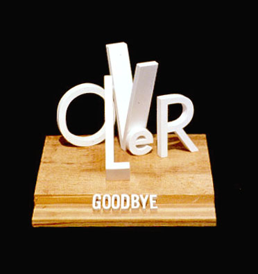
titles often become the complete "text." The title of one
of the sculptural works is "Goodbye." This word appears
at the base of the piece on a single plane. The text outside
the title consists of the word "lover." Given the angles
and positions of the letters, this word could be read in
several ways. The letter positions could suggest the
excitement and interconnection of love, and they could
just as easily suggest confusion and collapse. The word
"goodbye" in its straight-forward solidity brings either
condition to an abrupt and decisive close. The title
becomes much like a door that has shut. This is further
enhanced by the way the "l" in "lover" falls completely
forward, leaving the word "over" to stand emphatically
alone. The conventional text of "Out and About" is
simply the word "about" spread over fabric. The "O,"
however, is a much larger template for a rotary telephone
dial plate, suggesting the presence of a finger over the
highly tactile fabric. Of this work, Ernst writes "This
piece evokes a vacation. The background is a skirt that
my mother brought from Mexico in 1950. My sisters and
I wore it on various occasions: dress-up, Halloween, and
to school. I thought the skirt had played far too
significant a part in the happy times of our lives to be
discarded after my mother died, so I made a place for it
in 'Out and About.' The O-dial comes from a resort
phone that was being replaced." Recent work at times
takes lexical text and erodes the letters in one way or
another.
Since 1978, Ernst has kept notes on proposed projects
in a workbook called "Belles Lettres," a work that
Marilyn R. Rosenberg feels could be seen as conceptual
art. In an ever evolving set of paradoxes, the intense
tactility and immediacy of the poems realized so far finds
a counterpart in the ethereal character of concept, her
neat diagrams and precise notation extending
characteristics of Fluxus scores and proposals. Perhaps
there is a pleasant paradox in Ernst's notes, "Belles
Lettres," as they are published. In these, she returns to a
more conventional notion of what a text should be.
At present, Ernst is working on a set of proposals for
projects that include poems assembled as quilts, some of
which will interact with television monitors. As with her
magazines and mail art, the quilts and video include the
work of other participants. Insisting that poetry needn't
depend on words, the lines of quilt squares form rhythms
that approximate metrics in lexical poetry, and the video
medium provides oral replacements for alphabetic text,
just as the expressions and gestures of the people who
appear on the screen curb excessive abstraction in the
quilt squares. Quilts suggest homey qualities, just as video
depends on electronic technology. In the interaction of
the two, we can see Ernst's continued abilities to play
disparate textures off each other. At the same time,
there's little that people in or outside the arts can identify
with more than quilts and televisions �often enough in
conjunction with each other. This becomes another
means of outreach to a potentially wider audience.
The tone of Ernst's work ranges from comic to
contemplative, but does not become aggressive,
inconsiderate, or hostile. It's difficult to find a poet in the
current milieu less inclined to verbal or visual rhetoric,
cant, dead-ends, irrelevant decorations, hieratic poses,
and other types of obfuscation and distraction. This
naturally extends into one of her most winning features: a
light and open quality that refuses to revert to triviality. I
have had some fun calling this "the ability to have a good
time without becoming obnoxious." Although this
operates admirably through innumerable small-scale
decisions in her working methods, it also contributes to
one of her broadest concerns: to make poetry something
that refuses to stay closed. Such a statement at the present
time can sound like a rhetorical or theoretical trope. But
Ernst means precisely what she say: poems on T-shirts
that people wear wherever they go and poems in wooden
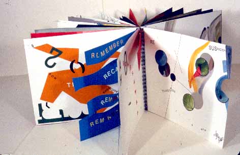
books bound in such a way that they cannot be shut.
Click here to go to K.S. Ernst Survey
Marilyn R. Rosenberg: Solo
Marilyn R. Rosenberg began her book art more or less in
a vacuum, with virtually no precedents or models. She
saw parallels to what she was doing in an article in Art
Write magazine by Judith Hoffberg, an artist, historian,
curator, and editor who has done as much as anyone in
North America to introduce mail artists and those in
related fields to each other. Rosenberg contacted
Hoffberg after reading the article, and arranged to meet
her in Los Angeles when she visited friends there later in
the year. Hoffberg showed Rosenberg some of her own
collection and introduced her to Bob Speigelman whose
massive archives gave her a sense of how extensive the
mail art network was and how much variety and
invention traveled through it. Back in Peekskill, New
York, Rosenberg began to go to NYC to attend mail art
and performance events at Carlo Pittori's apartment and
at Katz's Delicatessen. At this time, David Cole invited
her to contribute to MC, a magazine he edited
with Paul Zelavansky. Rosenberg thus found her way
quickly into the network, guided by major figures in it.
This lead in several directions. One that she sees as
particularly important comes from thematically oriented
projects and shows that stimulated her to try things she
otherwise might have missed. These generated ideas
during periods when she seemed about to slow down.
Inclusion of her work in catalogues for mail art shows
encouraged her to continue at times when she felt
isolated, and, through the network she discovered that
she was not alone in producing book art. Moving outside
the network, correspondents and colleagues in the
network arranged for her work to appear in conventional
art shows.
Throughout Rosenberg's opus, working materials and
final products hold a curious, sometimes whimsical,
sometimes searching, sometimes unsettling, sometimes
jovial, always engaging set of confluences through the
stages of creation and display, and, at the same time,
through a wide spectrum of genres. This amplifies and
deepens her ability to create works with multiple layers of
technique and significance. Motifs such as scissors and
thread not only appear in the finished work, they also
present the tools and materials used in its production.
Thread tends to foreground itself in many works, not
simply remaining an unobtrusive binding device, but
boldly contributing to the look and feel of finished books.
The scissors used in making books and visual poems may
not be the same as those represented or fastened to the
pages, but Rosenberg keeps them "in the picture" after
they have done their job. Scissors lead to recurring
motifs, such as keys, whose direct contribution to the
work seem less obvious. Simple connections include the
car keys that transport the materials and finished pieces,
as well as those used to get in and out of her studio and
her home. They can suggest opening things as ordinary as
a house door, or access to strange and wonderful
mysteries. However much symbolism a viewer might
want to read into these motifs, they never lose their basic
functions as tools. Even the books and poems can
become tools in odd and unexpected ways: in many
pieces Rosenberg recycles scraps from previous works.
Symbolic interpretations may come to dead ends: in
Rosenberg's art, the work always leads to something new.
The process of transition from one work to the next may
suggest some of the possibilities of interaction and
extension in mail art. The continuity of Rosenberg's work
through genres reveals both seriousness and insouciance,
and perhaps a certain rebellion or resistance along the
way. Active as a book artist long before the genre became
fashionable, Rosenberg's opus includes not only highly
polished books, but also inexpensively produced works
reminiscent of underground publications.
Much of Rosenberg's book art works as assemblages
in containers. As often as not, these include screenfold
formats and other devices to extend and multiply pages.
In a number of pieces, she binds the kind of drawn and
painted books that sometimes run under the name of
"artists' books" into larger structures. My favorites in
her opus work out extensions of book possibilities.
SHADOWLAND is a screenfold book, in which
the folds extend themselves vertically instead of
horizontally. Rosenberg designed this book to be hung
from a ceiling. Thus suspended, the book is
approximately 9' 5" long, consisting of 52 pages, each
made from a scrap of paper left from other projects.
Rosenberg calls the individual leaves "RUMBLE-
STRIPS," each representing a bump in the road through
her work. She sees the two orientations of the work as a
roadway: when read as a book, the reader's eye charts a
path leading earthward; when read as a mobile, the
viewer's eyes go from the street to the sky. Rosenberg
carefully chose the pieces of scrap from works that dealt
with roads and landscapes to create the sense of
automobile travel, with its long views toward the horizon,
checks of road conditions, and the flickers of peripheral
vision. Rosenberg describes the conditions of driving
thus: "Wet weather fights with windshield wipers,
sprinklers, taps, other water devices and visual poetry.
Sometimes angry, often confusing, car/life continues on
the road, with signs and cautions flashing by." The worn-
out metaphor of life as a road becomes renewed in this
piece. As often in Rosenberg's work, readers can see
unintended relations in the work with felicity. For me,
one of these resonances comes from the indigenous
calendars of Meso-America. These were painted in
screenfolds often meant to be read in descending panels,
and emphasizing the 52 year cycles of time - a lifetime for
an individual, an age for a community.
Like Shadowland, Rosenberg's Stories
from the Everyday World: It Happened That Way,
opens down, and was designed to be read fully opened.
Closed, it presents an interesting set of angles and curves
protruding from the standard rectangular bookform.
Bound by a string, pages of the opened book change
relation to each other as they are moved by such forces as
drafts and movement of people in the room in which it
hangs. Handling cut out and torn sheets from other
pieces gave Rosenberg a starting point for this book. She
developed both the succeeding page shapes and the texts
from these left-over papers. The progression of pages can
come across as soothingly rhythmic or aggressively
angular depending on changes in their relative positions,
and with the nearness or distance of the reader.
Rosenberg used black papers for the book, and limned
the text in low-contrast chalk and pencil. The brief texts
begin with "QUIET SCREAM." Other texts, in both
large and small letters, include "I DIDN'T SEE IT." "I
DID SEE IT," "JUST YESTERDAY?" "IT COULDN'T
DID," "SEE THAT THERE IT," "YOU CAN BE
SURE," and other phrases that might be written or
spoken during the course of virtually any day. Some
might reinforce the idea of a quiet scream, but others
seem to work in just the opposite direction, neutralizing
anxiety and working it into the variety of quotidian
experiences. The angles and curves, the torn edges and
those cut neatly reinforce the sense of the varied texture
of life, as does the fractured or ambiguous phrasing, and
the way things appear, disappear, and recombine
according to their movement and the reader's attitude
and position.
In Remember Babi Yar (The Ravine of
Women), Rosenberg's intentions and point of view
leave no ambiguities. This bookwork begins with a basic
screenfold, but the screens have auxiliary wings so that it
refuses to fold out flat. At what we could consider the
book's center, the numbers of massacred dominate a
sequence of folds. Life-size drawings of skeletal hands,
excerpts from published German records in tight, small
script, and stenciled words such as "suffering" and
"pyres," weave in and out of each other in layers behind
the dominant number. Auxiliary objects, including
photos of victims and facsimiles of the yellow paper Stars
of David that Jews were forced to wear as identification
during the Holocaust surround the main structure when
shown, or insist themselves on the reader's hands when
holding the book. Rosenberg confronts the problem of
what to say in the face of the unspeakable without
wandering into sophistry or the problems that a lesser
artist might encounter when stating the obvious. Her
particular abilities in extending and exploring the most
basic images and responses make this a completely
integrated and fitting memorial.
In bookworks such as Local Library,
Rosenberg's sense of humor and optimism have plenty of
room to move freely through familiar icons and images.
The seemingly endless folds of auxiliary books in this
piece suggest how much you can find in a small library as
well as its potential extensions, convolutions, involutions,
pre-, post-, sub-, supra-, epistemo-, and ontolo-
volutions. The tiny scale of the miniature books in this
library contributes to its humor as well as the kind of
busy activity of the people who come together in such
places. In this work, the paper speaks as loudly as
anything else. The piece also includes tiny found objects
such as scissors and ceramic fish which relate this to
other entries in Rosenberg's opus.
We could see a sort of classicism in the work of K.S.
Ernst: however complex the ideas she works with may
become, she orients herself toward clarity of conception
and of overall design. Marilyn R. Rosenberg's work tends
to proceed in layers, some working against each other in
what I like to call polyrhythms. In this respect, we can see
her dealing with the mystery and magic of daily life from
multiple perspectives.
Click here to go to Marilyn R. Rosenberg Survey
David Cole: Solo
Most of David Cole's friends and associates remark on
his restlessness and expansiveness, and the ephemerality
of his art. The three go together. He viewed his pluralistic,
all-encompassing art as a constant process of transition
and transformation. A peripatetic philosopher in the
most literal sense, he walked to think out ideas and as a
form of meditation. When not walking, he drew and
wrote while doing just about anything that left a hand
free. He considered walking and all forms of drawing and
painting as types of writing, dancing, and, at times,
praying. His conversations seldom stayed on-subject, but
wove whatever you and he were saying into new and
surprising or illuminating patterns. An indication that his
verbal meandering didn't lack relevance comes from the
fact that the members of the synagogue he and his wife
attended during their years in Brooklyn referred to him
as "Rebbe," a term of respect conferred on wise people.
This reference was all the more meaningful since Cole
was a devoted practicer of three major religions,
Christianity, Buddhism, and Judiasm and performed
"mitzvoth" (good works that are also a form of prayer)
by working with the homeless in Brooklyn. During one
phase of his life, his beard extended to the middle of his
chest, and he dressed in flowing white robes, pulling
together numerous traditions as a form of affirming them
all.
One of the bases of Cole's art came from a delightfully
unorthodox interpretation of William Empson, the
subject of his doctoral dissertation. Cole wrote that
Empson's "The Structure of Complex Words
enabled me to understand that meanings inhere in
transactional ways - words are always in process, both as
they are being written and as they are being read. This has
been at the root of my entire knowledge of and interest in
art and language as exchanges, both in the practical sense
of being given away and in the more complex
epistemological way of artwork being completed in
dialogue and present in receipt." I doubt that Empson
would have seen this operating in correspondence art,
and for me at least, there's some fun in seeing how far
Cole's broad and eccentric artistic exchanges and
transactions could move away from the cloisters of
academe.
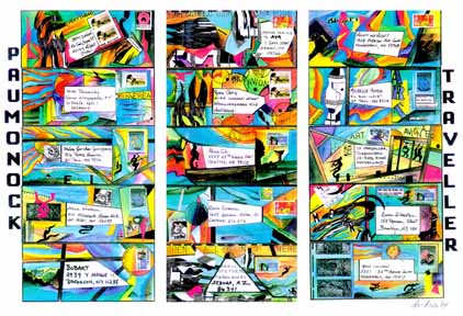
As a literary ancestor, Cole saw Walt Whitman not
simply as a revered source but as a daily companion.
Beginning at least as early as the early 1970s, he identified
himself as "The Paumonock Traveler" in his
correspondences and began including that traveler in
performance art, drawings, and poems. Near the end of
his life he wrote, "My work is gathered under the rubric
of The Life and Love Songs of the Paumonock Traveler,
as if it were my daily reports as a leaf of grass blown in
Walt Whitman's scene of the struggle for identity and
democracy. He had sung his song just 100 years before
me in Brooklyn Heights where I began my visual poetry
work. I am singing back to him from a singular point of
view." You can find plenty of poets who can quote
Whitman, and write long-lined poems in something like
his style, but few have taken his ideas and example as far
as Cole. For him, all arts lead into and out of each other,
and he gathered everything he could find into the
process. This included the participation of everyone with
whom he shared ideas.
This inclusiveness didn't mean drawing his associates
into a predetermined mold, but finding their individual
characteristics and working with them in a spirit of
cooperation and encouragement. In the late 1960s and
early 70s, he devoted much of this spirit to his students,
toward anti-war activities, to the formation of an artist-
run gallery, and to performance art. He practiced a type
of automatic writing that included as many images as
words, and his letters to friends often followed suit. The
importance of integrating alphabets with other forms of
writing was an important subject of conversation
between David and me, both of us seeing the alphabet as
a great form of writing, but one that needed extension. By
the mid 70s, Cole found his ideal environment in mail
and correspondence art. Nothing could suit his sense of
democracy and expansion of potentials as well as a mail
art network that could foster transactions with thousands
of people. Not content simply to take part in the network,
he set up shows in venues ranging from Franklin Furnace
to his synagogue. Most important of these shows was "The Scroll
Unrolls," apparently the first mail art show
mounted in Israel. As much as the global reach of mail art
appealed to him, he also needed the intimacy of
correspondence art. A measure of his commitment to
"the struggle for identity and democracy" comes from
the way that he worked differently with each of his co-
workers, adjusting his own contribution to their
particular skills, abilities, and aesthetics. Cole was also
collecting knowledge and skills in each area. An able
writer from the beginning, he broadened his abilities as a
graphic artist through collaboration. Cole and his
correspondents acted as mentors for each other.
Collaborators included people outside the mail art
network. In New Jersey a dance group was excited by
huge pieces that Cole created by covering himself with
paint and rolling on the canvas. In others he danced
barefoot on a newly-painted canvas. The group
choreographed a dance based on the paintings, and
music for it was created on the basis of what the
composer saw in the paintings.
As part of his classes, Cole had his students scour
second-hand stores, dumpsters, and every other
collecting point for things used and abandoned as
sources for poetry and for art. Prizes found in such places
suggested the fullness of the world and the sense of
discovery in humble objects. As Cole moved more deeply
into mail art, he became interested in envelopes as more
than containers which are usually discarded after they've
carried their contents. Each envelope's flat surface
presented a ground on which to work. Cole's expertise in
painting them expanded with practice. Sometimes
photocopying the painted envelopes formed the base for
further recycling. Occasionally he composed groups of
them into grids, thereby creating new artworks, some the
size of broadsides and some larger. Reducing the images,
he made stamps out of them which he pasted onto
envelopes. These broadsides and stamps became part of
the Paumonok Traveler's journeys around the world and
back. The grid nature of stamp blocks fascinated him
early on, at a time when he worked primarily with ink on
paper. He could produce hundreds of sheets exploring
the interrelation of postal icons and stamp grids. As time
went on, this process lead to grids produced with early
computer graphic programs. As computer technology
advanced, he stuck with older programs in part because
he liked the chunkiness of the images they produced,
reminiscent of the used items he found in dumpsters and
second hand shops. Some of these computer images he
gathered into books in which the images wandered in and
out of grids other than those created by rows of stamps.
The nature of containers fascinated Cole, and, true to
form, he extended this dimension of envelopes. He drew
all sorts of metaphors out of envelopes and the way they
get opened: people, houses, cities, land masses, space
ships could all be seen as envelopes. From his observation
that clothing made up a type of envelope, he began
painting on white paper lab coats and extended this
further to suits and other garments. Toward the end of
his life, shrouds became yet another type of envelope.
Most of his shroud pieces attained enormous size, some
over 20 feet long. His notes on them include: "Shroud #2
'Crossing Over' narrates the journey, by boat, of the
return of the spirit from the form. Shroud #3
'Recollections of the Unknown' engages the chaos
ensuing upon the loss of personal identity; it is shroud as
aeropost." His final large-scale works, "Floor Poems,"
"were envisioned as views down through the ground into
space beyond the earth." In one of his last shows,
mounted in the huge space available at the Ice House in
St. Paul, Cole arranged the shrouds, floor poems, suits,
assemblages, and other works in such a manner as to
keep the paintings away from the walls, the suits
suspended over the floor poems, etc. in such a way as to
cast shifting shadows around the room.
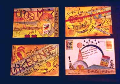
I'm now looking at one of his Paumanok Traveler
broadsides based on painted envelopes placed in grids.
This 8 1/2 x 14 sheet contains images of twelve number
10 envelopes reproduced in two columns of six each.
Cole takes some characteristic of each addressee into
consideration in each of the painted envelopes. One
addressed to me has my address on a long wall drawn in
such perspective as would be seen from the window of a
moving car, reminiscent of my Milestones poems. The
reduced copy shows the original clearly, with no
modifications. One addressed to Ruth and Marvin
Sackner includes elements suggesting a collection of work
by visual poets. K.S. Ernst's includes two large, neatly
drawn squares. Inside them, stencil letters interact with
each other in the same way they do in Ernst's work of the
time. A large square that frames the postage stamp
reiterates Ernst's "press me close" publishing logo, and
implies that he has followed her "Place Stamp Here"
instructions. Cole frames these streams in plates of glyphs
suggesting those Kempton featured in his
Kaldron magazine. None of the references to the
works of addressees is overstated, but in each there is an
acknowledgment by Cole of what his correspondents do.
This makes the address expressed in letters and numerals
more personal, and extends it across the whole of the
envelope.
Cole was fascinated with sticks of various sorts. It's
easy to see how they formed the most rudimentary of
implements, used to aid in walking or in reaching beyond
the hand's grasp. Some of these relate to his interest in
containers. Poles used to store or transport cloth of all
sorts, from unfinished material to rugs, acted as
something like inverted envelopes - containing objects by
being contained by them. He began using wands early in
his performance pieces. Sticks used to stir paint run
through various permutations. He set up projects for
exchanging them, evolving into a paint stirrer MAP. The
paint stirrer project included the distribution of 2,000
hand-painted and signed wooden paint stirrers to artists
around the world over the period from November 9,
1996 through January 2000. The recipients of the paint
stirrers were asked to lend their stirrers to a temporary
In-Gathering Exhibition. The idea behind this MAP, as
conceived by Cole, was the simultaneous stirring of
different members of the community in an event of
sharing through diversity and uniqueness. David Cole
died on April 19, 2000, before the show came together,
but he would have been pleased to see how many stirrers
returned for the exhibition.
For Cole, the transactional and collaborative nature of
art kept it constantly changing, reaching stages of rest at
times, but not firm conclusions. He found himself
completely at home in the mail art network where,
according to some, process took precedence over
resulting artifact. Still, Cole was not satisfied with any
given stage unless he found it aesthetically pleasing and
appropriate. This was remarkable in that he often learned
how to make it so as he went along. Acquiring the skills
to achieve his aesthetic goal for a given stage came
primarily through the mail art process. Given the wide
range and diversity of his contacts, his work often
reflected the abilities and challenges of the network itself.
K.S. Ernst seems a model of classical clarity.
Marilyn R. Rosenberg suggests the wealth of
possibilities in congruent and conflicting layers. David
Cole thrived on what he learned from both, synthesizing
it with other modes operating in the network and with
everything else he could find, ranging from the
theoretical inquiries of William Empson to the poetry of
Walt Whitman to action painting to performance art to
junk found in a dumpster to paper to dance. Each of the
three artists discussed has a distinct personality and a
singular orientation to the art they have produced. Using
musical analogies for these orientations, and stepping
back a bit from the contemporary scene for clarity's sake,
Ernst's work may find a parallel in W.A. Mozart,
Rosenberg in Gustav Mahler, Cole in Charles Ives. The
differences in their orientations contributed considerably
to their abilities to collaborate and make the most of their
individuality in the undogmatic and noncompetitive mail
art environment.
Click here to go to David Cole Survey
Choruses
Ernst, Rosenberg, and Cole made contact with each other
through the mail art network at aproximately the same
time. Perhaps it's instructive that neither Ernst nor
Rosenberg remembers the precise time or circumstance
or MAP. All three lived in different cities but the same
part of the country. Hence projects they worked on
together involved significant use of the postal system, but
also permited in-person meeting without long distance
travel. Of projects on which they collaborated, those
described here sketch some of the range and nature of
mail art projects.
K.S. Ernst lent me a number of works she did in
collaboration with David Cole in the early 1990s. None of
these were done with publication or exhibition as a goal -
or as something to avoid. Following one of the strongest
tendencies in mail art, they wanted to explore their
abilities, to have some fun, to see where the collaboration
would lead, and, as important as anything else, to hold a
dialogue through their work, to make their projects a
form of conversation.
Seeing what they could do with computer software
was a base for the conversation in the work. At the time,
few people in the mail art network used computers, and
some viewed work done by such means as heretical. Cole
tended to work on originals sent to him by Ernst or to
start new pages. Ernst generally made several immaculate
photocopies of pages received and developed a number of
pages out of each. The computer output portions seem
easy to identify, since Cole favored the stair-step nature
of graphics done on a dot matrix printer while Ernst used
a laser. Both followed the add-to-and-return approach,
but did not work in a linear sequence. Instead, they
exchanged pages in groups and developed several
simultaneously.
The group includes running puns on the words
"nova," "ruse," and "use," and words related to
messages and signs. On one page, I can see from the
nature of the print that Cole had repeated the word
"signal" in one column and "sentinels" in another.
Ernst produced standard dingbat icons in similar
columns. Although there's no way of telling who did
which first, each signal and sentinel becomes associated
with an icon. Arrows by Ernst between the columns and
their icons connect signals to sentinels, identifying the
connections as "myth," "clash," and "it happens."
Thus a compass pointing north is tied to a star icon and
identified as "myth," while the line between a deer and a
factory is pointed out as a "clash." The first step in
creating the image presented an austere set of columns, to
which another set was added. The angular lines animate
the center of the page, and lend their dynamic to the
columns. Collaborators often enough take on the ideas of
their partners, and in the icons and diagrammatic lines,
Ernst seems to be picking up on some of Cole's
conceptions of linguistics. It's possible, however, that
Cole worked from Ernst's arrows, supplying structural
constants for her diagrams. The top of the page bears the
words "AN OVERUSE," as a title and several
simultaneous sets of instructions or comments on what
goes on in and between the columns.
On the next page, which may have been done
simultaneously or as a response to this one, the headline
is "AN OVA-RUSE," stated in a clear Roman face,
repeated in three different forms of redrawing and
mechanical distortion. Below this there are four columns.
The one at the far left, in clear Roman, bears such words
as "eye Aye/oh please/ha." In the next column on the
left, these words find mirrors in "bales
hey/ahsneeze/budhaha" in fractured letters. Though the
Roman face is definitely Ernst's and the second column is
Cole's, Ernst does not remember which came first.
Moving left to the two other columns, these words appear
in two different forms of distortion. You could read the
page from left to right as a move into clarity, or from
right to left as a progression into abstraction. These pages
do not represent a finished product, and were not made
with any specific goal other than a scintillating type of
conversation. A good deal of the work that passed
through the mail art network holds this kind of dialogue.
In late February, 1986, Marilyn R. Rosenberg and
David Cole began a MAP based
on travel by train. When they began they simply had a
few basic ideas they wanted to explore, but no limitations
or projections on how large or complex the work should
become. What began as a private exchange moved into
public form meant for exhibition. By December 31, when
they formally concluded the project, it had grown very
large, including hundreds of individual pages, post cards,
books, posters, and ancillary pieces.
For decades, mail has travelled along train tracks.
Train travel moves in a strictly linear manner, seeminlgy
more so than travel by foot, car, or plane. Mail going
between two people requires a frequently repeated route -
it may be linear, but the line runs in two directions, and
has a cyclic character. At the same time, a railroad can
include any number of sidings, spurs, intersections and
other alternate routing systems. Rosenberg had
revitalized the metaphore of the road of life in other
works, and in this one she and Cole extended it in as
many ways as the year of collaboration could hold. At
times, the two artists worked with stories and bits of
speech overheard on trains.
It seems appropriate that the book's central painting,
titled "Carousel," should be based on a locomotive
roundhouse, which acts simultaneously as a music box
and a mandala. This included a train key Rosenberg
purchased from a railroad comany, which fit in a lock in
the Carousel. A roundhouse serves not only as a place
where locomotives get repaired, it also becomes a
meeting place from which rail lines grow and to which
they return. All lines lead to and come from this circle.
One of the basic lines of development in the project
came from the letters "op," the reverse of the initials for
post office, and a key component in the words "optical,"
"option," and "opportunity." This became an
exhaustive analysis of words with this pair of letters and a
means of generating new side trips into words and idea-
complexes ranging from "opossum" to
"MetrOPolitan," which supplied a key motif, "opolit."
Other words and fragments, including "re" and
"fragment," followed similar lines of development.
Phonemes suggesting train noises and motion played an
important role, at once suggesting an audio score, serving
as a generator for new terms, and acting as a tool for
dissecting words that had entered the work. Addition and
amplification played a similar role, and the work includes
lengthy personal letters, stories, records, and poems in
multiple genres. Contrasts between standard geometric
shapes and organic forms generated texts and images.
Cole made extensive explorations of folded paper;
Rosenberg avidly researched books on trains for collage
material. As the project became more complex, they drew
up charts and time tables, following those used by
railroad companies, to keep track of their tracks with all
their stops and side trips. Some of the side trips included
most other forms of travel, ranging from inward journeys
to exploration of outer space. Cole's Paumonock Traveler
naturally made an appearance early, but given the
complexities of the journey, morphed into several other
characters, just as Rosenberg created several alter-egos,
most prominently Mary Rose. The MAP encompasses
not only visual poetry, book art, and sculpture, but also
an epistolary novel.
For some people at the turn of the milenium, trains
include nostalgic or sentimental conotations. Rosenberg
and Cole didn't avoid this but made the most of it. A
formal aspect that they deliberately worked with was the
way trains suggest perspective - if you look at a train from
nearly any vantage point, it will grow smaller or larger
along geometric lines. This opens up possibilities for
exploration of a concern in traditional art. At the same
time it allows for exploration of perspective as an
individual's point of view and the way that the
perspectives of two people can inter-relate. One of
Einstein's classic explanations of relativity relies on train
metaphores, and that description suits this work very
well. On a more personal level, all sorts of people can
relate to the daily monotony of comuter trains, the magic
and mystery of night time train rides, trains as a means of
escape, and trains as symbols of expectation. You could
see this work as an assemblage, but uniting the concept of
book and luggage seems much more appropriate. Hence
a suitcase became the "binding" for this book.
Of the work and their sense of its significance to its
readers, Rosenberg and Cole wrote: "It is as if the viewer
were the third person in a train compartment travelling
somewhere, perhaps back and forth, as the compartment
fills up with the bits and pieces of the present and the
past. This could almost be a commuter train, but [the
artists] do not seem to be going from home to work; they
seem to be at work observing themselves travelling. They
muse; they share perspectives; they call one another's
attention to things that they just noticed off to the side of
the moving train. They wonder what a train is and why it
is on track. They clip their sentences to each other,
hurrying the other to fill in the spaces with common
meaning and get on with seeing what they're doing. They
encourage one another's attention, bolster spirits, suggest
new ways to hold perceptions in form." Cole added the
following note as a definition that formulated itself as the
work progressed: "Visual poetry is about the relationship
between the aesthetic movement of the eye in
conjunction with the literary movement of the mind."
This seems a good summation of the book, the working
principles of the artists, and of the way mail art works for
those who practice it and those who see it.
By 1991, Ernst, Rosenberg, and Cole had been
collaborating on MAPs for more than a dozen years. That
summer, the three decided to work together in person.
Ernst had a studio separate from her summer house
which seemed an ideal place for a project. Rosenberg and
Cole joined her there for a weekend session. Neither
Ernst nor Rosenberg remembers who proposed the
theme for the MAP, which suggests that the collaboration
held more importance than anything else. It seems likely
that the project originated more or less spontaneously
during their initial discussions. The result was a book
which they titled Spider Talk. The book has very
little in it that immediately suggests spiders or the lines
and connections of a spider's web. The spinners of this
were the three artists constructing a new web after they
had made other invisible webs by their exchanges of mail.
Rosenberg says that she was impressed by the bright
and airy nature of the studio and its surroundings, an
environment significantly different from the small spaces,
largely lit by artificial light, of her studio and of Cole's
workroom. This may have contributed to the delicate,
serene, and open quality of the work. Rosenberg brought
a blank book in screen fold format, with twenty four 4
3/8" x 6 1/8" pages on each side. The three moved
around a large table in the studio, each working on
several pages of the screenfold until they felt it time to
move themselves or the long strip of paper and add to
what the others had done previously. They did not
procede sequentially along the strip, but worked on
multiple page spreads simultaeously. Though they had
plenty of experience working over each other's pieces
through the mail, they felt a bit hesitant to do so in
person during the first few hours of their efforts. Most of
their conversation during composition stayed focused on
the project, not straying much into other subjects. This
conversation creates a real-time web across the book's
pages, changing the scale of the webs created through the
mail. Rosenberg recalls that Cole tended to be relatively
quiet, taking, as he often did, cues from his partners
rather than trying to direct the project. Cole tended to be
completely caught up in the process of composition
rather than the final product. Rosenberg placed a bit
more emphasis on reaching a goal, and examining the
implications and significance of the finished work. Ernst
tended to zero in on specific details of the piece, bringing
her usual spontaneity and decisivness into the picture.
Ernst sees a certain amount of division of methods in the
process, though she notes that the three moved into each
other's procedures more as they progressed. Rosenberg
placed most emphasis on painting broad designs in
gouache. Cole tended to work over these in pen. Ernst
pasted paper onto the pages, on some of which
Rosenberg painted and Cole drew.
As with much book art of the last decade, most people
who see this piece are likely to see it in a glass case. This
is, as always with book art, unfortunate. Holding the
book, you can view two to eight page openings easily,
while still getting a sense of the delicacy and intimacy of
its details. You can also spread it out for panoramic
views. Right now I have the obverse opened complete on
shelves across one side of my workroom, seeing it in
much the same way that a viewer would see it in a gallery.
The general impression I get of the work seen in this way
is of modulated washes of color. The color suggests the
airy quality I mentioned earlier. Nothing appears
growded or congested or tense. Rather, its gentle rhythms
flow pleasantly back and forth through its pages.
Although the color areas tend toward browns and grays,
areas of brighter color, judiciously placed lines in
primaries, and ample space left unpainted don't leave the
darker areas brooding. The washes of color feather out
amorphously in some places, and in others come to hard
edges, defining parts of geometric forms in negative
space. This can suggest some of the play between organic
and geometric forms found in Track and other
works by the three artists. It also has some of the
character of Chinese and Japanese painted screens, which
make the most celebrated use of negative space.
The book becomes much stroger when held in hand.
The screenfold format allows for juxtaposition of varying
page sequences, forming and reforming different collages
as I fold groups of pages up, bringing, say, page 3
together with page 16. Held in hand, it's easy enough to
go from the obverse to the reverse. One of the things I
particularly like about this book comes from another
kind of collage - created by pasting paper onto the master
sheet. All the papers used are relatively thin, but range in
character from hard surfaced stock to rice paper with
pronounced fiber strands to a brown mulberry paper
whose varied strands have been calendered smooth on
one side and left rough on the other. Thus the washes
naturally give rise to a bas relief, subtly playing textures
against each other, as though the washes seek fuller
expression in layers of paper. Ernst printed the cover
sheets using a computer printer, and the artists signed the
book's first page. There is otherwise no text. The book,
however, does contain a fair amount of pen work. In
some places this comes in the form of what could be read
as spider armies or as imitations of Kanji characters
written in grass script. Small line figures act as something
like grace notes. More often spare lines bring together
sets of pages and areas of color. However line manifests
itself, it gives definition to broader forms by contrast.
Providing this kind of reference keeps the looser forms in
focus.
The book unfolds as a rhapsodic exploration of the
possibilities of the materials available and of the ideas the
participants bring to them. The book should be seen and
read as an expanded form of literacy. If that happens only
on a tiny scale, the book, like other works produced
through the Mail Art network, served the basic functions
of interaction, encouragement, challenge, and a means of
bringing happiness to the artists as they worked and as
they have looked back on the project. Whatever happens
in Mail Art in the future, and however work produced in
the network may find new audiences, the book has served
its most basic function. Throughout the 20th Century, all
sorts of people extolled the virtues of making art for
themselves in an exultation of their individuality. This
acts as a tonic for art made under various forms of
coercion, including those that have been internalized.
Making art for yourself my be a fine thing to do. But
there are also virtues in making art for someone else. Art
thus becomes a gift. In collaborative situations, an
important part of the gift comes from the process of
cooperative production.
Click here to go to Track, a collaboration between David
Cole and Marilyn R. Rosenberg.
Long Range View from a Short Range View Finder, a collaboration
between David Cole and Marilyn R. Rosenberg.
____
2001
Click here to return to Some Volumes of Poetry
|
|